XDAT User Manual
- Contents
- Importing Data
- Editing Data
- Creating and using Parallel Coordinate Charts
- Creating and using 2D Scatter Charts
- Clustering
- Working with Sessions
- Working with large Datasets
Importing Data
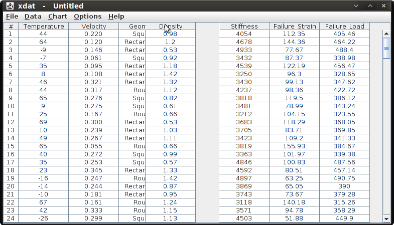
Before being able to do anything useful in XDAT, you first need to import data. All data to be imported must be in ascii format and should be split in columns, as if you wanted to import it into e.g. Excel. The data may or may not have headers in the first line.
To get started, you can test the software using the sample file included in the distribution. It is called Example_data.txt.
Import Settings
Before importing data for the first time, you should define the import settings. Click on "Import Settings" in the "Options" menu. This brings up the following dialog:
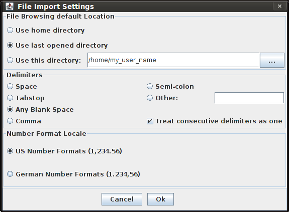
The upper section allows you to choose the default location for file browsing dialogs.
The middle section lets you choose how the data columns are delimited. If you choose "other", you can type a delimiting character into the adjacent text field.
The checkbox in the lower right corner of the middle section lets you specify whether consecutive occurrences of the delimiting character should be treated as a single one.
The lower section lets you specify the number format. Choose US for data which uses periods as decimal character and German for data which uses commas as decimal character. The respective other character is used as digit grouping symbol.
Data with Headers
If you want the parameter names to be recognised by XDAT upon import, the first line of your file should contain these parameter names, delimited in the same way as the data itself.
To import the data, choose "Import data with headers" in the "Data" menu. In the upcoming dialog, select the file containing the data. If after the import the data is not split into columns as you expected it, go back to the import settings to verify your delimiter settings.
Data without Headers
To import data that does not contain any headers, choose "Import data without headers" in the "Data" menu. In the upcoming dialog, select the file containing the data. If the data is not split into columns as you expected it, go back to the import settings to verify your delimiter settings.
Updating Data
If you have already created charts (and possibly also modified/customised them), you will notice that when trying to import data with the options described above, you will be warned that all charts will be closed. However, if the data you want to import has the same number of parameters as the one currently loaded, you can update the datasheet without closing the charts.
Choose "Update data with(out) headers" from the "Data" menu. The datasheet will be updated and all charts will be rebuilt based on the updated datasheet.
Note that if designs had been grouped in clusters this information will be lost after the update.
Parameter Types
XDAT supports two different parameter types:
- Numeric parameters
- Non-numeric or string parameters
Numeric parameters are parameters that can be expressed with floating point values.
If for any design in the datasheet the value of a parameter can not be parsed into a floating point value, the parameter is assumed to be non-numeric. As a result, each value that was found for that parameter will be represented by a tic on the axis, irrespective of the display settings that were made for that axis.
Editing Data
XDAT mainly relies on the data being imported from an external source. If fundamental changes must be made to the datasheet it is easiest to edit the data in a separate application and reimport it into XDAT afterwards. However, some basic functionality is provided to edit data.
Editing single Values
You can edit single values of the data table by double-clicking into a cell and typing in a new value.
If any charts are open they will be updated to reflect the change.
Removing Designs
Select the designs you want to remove. Then, select the menu item "remove selected designs" from the "data" menu. Since release 2.2 you can also select designs in parallel coordinate charts directly.
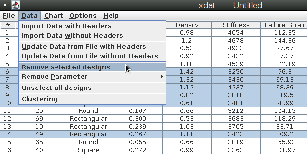
If any charts are open they will be updated to reflect the change.
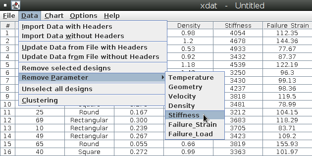
Removing Parameters
From the "data" menu select the menu item "remove parameter". A submenu with a list of existing parameters will open up. Select the parameter you want to be removed.
If any charts are open they will be updated to reflect the change.
Changing Parameter Order
You can change the order of the parameters by left-clicking a column header on the datatable and dragging it to the desired location as shown on the screenshot below.
If any charts are open they will be updated to reflect the change.
Alternatively, you can use the chart's context menu entries "move left" and "move right" to move an axis or, even easier: Left-click on the axis and drag it to the desired location (since version 2.0).
(Un)selecting Designs
You can select designs in the datasheet table simply by clicking them. Hold the shift key to select continuous intervals. Hold the control key to select more than one interval. Unselect all designs by either hitting the Escape key or choosing "Unselect all designs" from the "Data" menu. The design selection will influence the display of charts under certain chart configuration conditions.
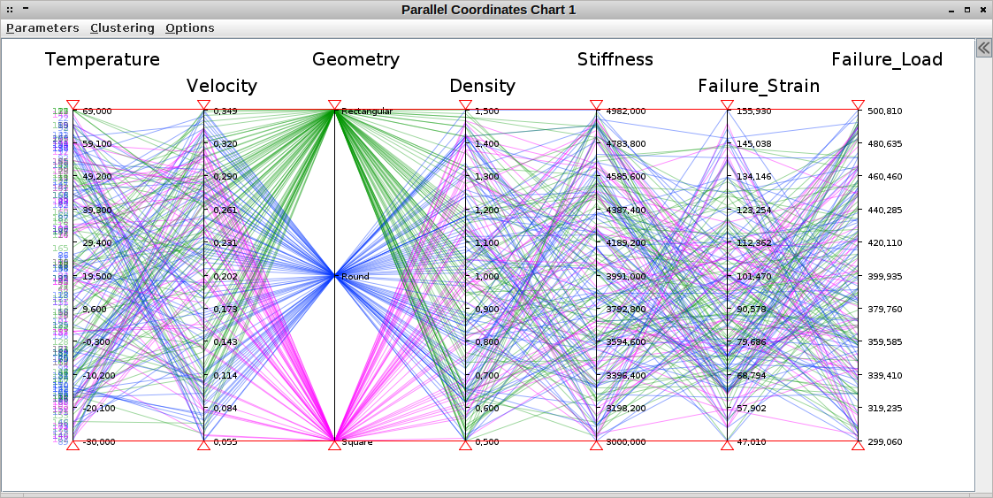
Creating and using Parallel Coordinate Charts
Creating a new Chart
In order to create a chart, simply choose "Create Parallel Coordinates Chart" from the "Chart" menu.
Choosing Parameters
In the chart, use the "Parameters" menu to choose the parameters you want to be displayed.
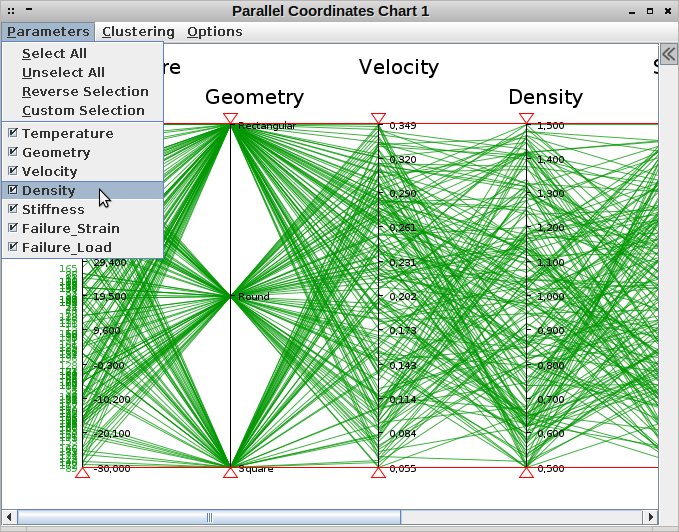
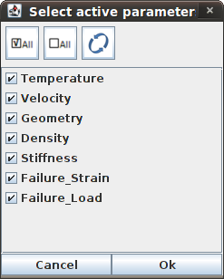
You can directly (un)select single parameters in this menu, but if you want to make several changes at once, it might be more convenient to choose "Custom Selection", which brings up a new dialog in which parameters can be (un)selected.
Alternatively you can use the chart's context menu "Hide axis" to unselect a parameter from display (since version 2.0).
Using Filters
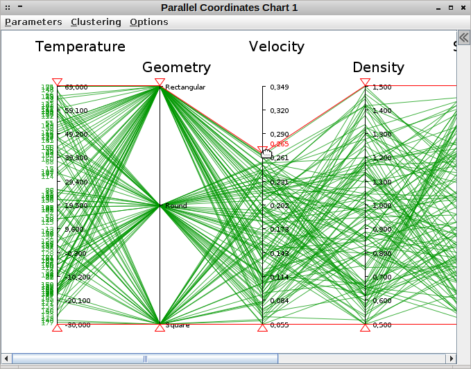
In order to filter the data, you can drag the small triangles on top and on the bottom of each axis with the mouse as shown in the picture below. You will notice that this removes designs from the display, depending on whether they cross the axis above or below the filter you are currently dragging.
While you are dragging a filter the filter's value is displayed right next to it unless the parameter being filtered is a non-numeric parameter.
Alternatively, you can filter data by dragging a rectangle over the axes you want to filter. ALl designs that cross the selected axes within the drag region will remain visible, the others will be filtered.
Customising Charts using Display Settings
You can customise many settings of how the chart is displayed. To do this, choose "Display Settings" in the "Options" menu of the chart, which brings up the dialog shown below.
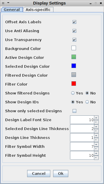
On the first tab titled "General" you can make the following settings:
- Offset Axis Labels: Vertically offsets every second axis label to avoid overlap of long labels. (Since release 1.7)
- Use Anti Aliasing: Makes parallel charts prettier at the cost of performance on large datasets. (Since release 2.2)
- Use Transparency: Allows semi-transparent colors in parallel charts at the cost of performance on large datasets. (Since release 2.2)
- Background Color: The background color of the chart.
- Active Design Color: The color in which the designs that are not filtered are displayed.
- Selected Design Color: The color in which the designs selected in the datasheet table are displayed. Only applies if "Show only selected Designs" is unchecked. (Since release 2.1)
- Filtered Design Color: The color in which filtered designs are displayed. This is only relevant if "Show filtered Designs" is activated (see below).
- Filter Color: The color in which the filter triangles and their labels are displayed.
- Show filtered Designs: Switches display of filtered designs on and off.
- Show Design IDs: Setting to choose whether the design IDs should be shown on the left of the chart, next to the first axis.
- Show only selected Designs: When checked, only designs selected in the datasheet table will be displayed. (Since release 2.1)
- Design Label Font Size: Changes the font size of these IDs.
- Selected Design Line Thickness: Changes the line thickness of designs selected in the datasheet table. Only applies if "Show only selected Designs" is unchecked. (Since release 2.1)
- Design Line Thickness: Changes the line thickness of designs. (Since release 1.8)
- Filter Symbol Width: Specifies the width of the filter symbols.
- Filter Symbol Height: Specifies the height of the filter symbols.
The second tab titled "Axis-specific" provides the following options:
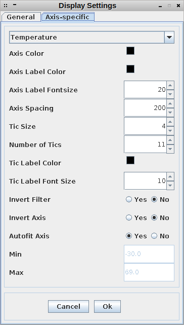
- Axis: Choose the axis you want to customize from the dropdown menu. (Only available in chart-specific settings, not in the default settings.)
- Axis Color: Changes the color in which axes are displayed.
- Axis Label Color: Changes the color in which the title is shown on top of the axis.
- Axis Label Fontsize: Changes the font size of the title on top of the axis.
- Axis Spacing: Allows to modify the distance between an axis and its adjacent axes. This can be useful to prevent long axis titles from overlapping each other, or to move axes clother together when there are many parameters to be analysed.
- Tic Size: The length of the tics on the axis.
- Number of Tics: The number of tics shown on the axis. Note that values entered here are only processed if the parameter is numeric.
- Tic Label Color: The color of the values displayed next to the tics.
- Tic Label Font Size. The font size of the values displayed next to the tics and the filters.
- Invert Filter: This inverts the filter behavior. The normal behavior is that only designs are shown that cross the axis between the filters. When choosing "invert filter", only designs that cross the axis on top of the upper filter or below the lower filter are shown.
- Invert Axis: Flips the axis upside down, i.e. small values are shown on the top and large values on the bottom.
- Autofit Axis: Automatically chooses the axis range such that all designs can be displayed. Note that autofit can only be switched off for numeric parameters.
- Min: When "Autofit Axis" is switched off, this field is enabled and you can specify the lower limit of the axis.
- Max: When "Autofit Axis" is switched off, this field is enabled and you can specify the upper limit of the axis.
If you want to change the settings in general and make the new settings your preferences, you can do this by choosing "Default Display Settings" in the "Options" menu of the main window.
Using the Context Menu (Since release 2.0)
Since release 2.0 the parallel coordinate chart provides a context menu with the following entries:
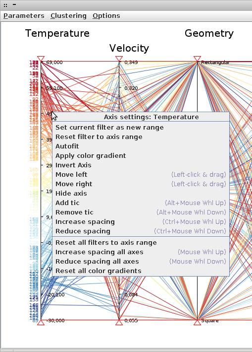
- Set current filter as new range: Sets the axis min and max values to the current lower and upper filter values, respectively. (Disabled for discrete parameters)
- Reset filter to axis range: Moves the filters to the current axis bounds.
- Autofit: Automatically chooses the axis range such that all designs can be displayed. (Disabled for discrete parameters).
- Apply color gradient: For each design a color is set according to its value for the chosen axis. This results in a color gradient through all designs representing their respective value on the given axis. Useful to find correlations without filtering. (Since release 2.2)
- Invert axis: Inverts the selected axis. (Since release 2.2)
- Move left: Moves the clicked axis to the left of the adjacent axis on the left.
- Move right: Moves the clicked axis to the right of the adjacent axis on the right.
- Hide axis: Hides the axis from the view.
- Add tic: Increases the tic count of this axis by one. (Disabled for discrete parameters)
- Remove tic: Reduces the tic count of this axis by one. (Disabled for discrete parameters)
- Increase spacing: Increases the distance of this axis to its adjacent axes.
- Reduce spacing: Reduces the distance of this axis to its adjacent axes.
- Reset all filters to axis range: Moves the filters on all axes to the respective axis bounds.
- Increase spacing all axes: Increases the distance of all axes to their respective adjacent axes.
- Reduce spacing all axes: Reduces the distance of all axes to their respective adjacent axes.
- Reset all color gradients: Sets color of all designs back to the state before any color gradients were applied. (Since release 2.2)
Changing the Display Settings directly with the Mouse (Since release 2.0)
The probably fastest way to change the display is using the mouse.
- Axes can be moved around by left-clicking and dragging them to the desired location.
- The axis spacing of all axes can be changed by hovering over the chart and turning the mousewheel.
- The axis spacing of an individual axis can be changed by hovering over that axis, holding down the ctrl key and turning the mousewheel.
- The tic count of an axis can be changed by hovering over that axis, holding down the alt key and turning the mousewheel.
Exporting a Chart to a png Image
In order to export a chart, simply choose "Export to png" from the "Options" menu. (Since release 1.8)
Creating and using 2D Scatter Charts (Since Release 2.0)
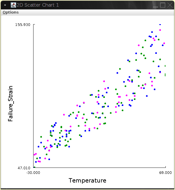
Creating a new Chart
In order to create a chart, simply choose "Create Chart 2D" from the "Chart" menu.
Customising Charts using Display Settings
You can customise many settings of how the chart is displayed. To do this, choose "Display Settings" in the "Options" menu of the chart, which brings up the dialog shown below.
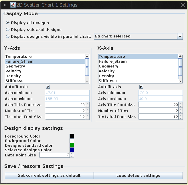
The upper part of this dialog is explained in the section Using Filters and/or the Datasheet Selection.
Right below comes a section which lets you customize the x- and y-axis. Change the plotted parameters for each axis on the fly by simply clicking them in the lists.
Below the parameter selection list the following settings can be made for x- and y- axis individually:
- Autofit Axis: If activated, automatically chooses the axis range such that all designs can be displayed. Note that autofit can only be switched off for numeric parameters.
- Min: When "Autofit Axis" is switched off, this field is enabled and you can specify the lower limit of the axis.
- Max: When "Autofit Axis" is switched off, this field is enabled and you can specify the upper limit of the axis.
- Axis Title Fontsize: Changes the font size of the axis title.
- Number of Tics: The number of tics shown on the axis. Note that values entered here are only processed if the parameter is numeric.
- Tic Label Font Size. The font size of the values displayed next to the tics.
The bottom section allows to make further, general customizations to the display settings:
- Foreground Color: Changes the color in which axes, tics and labels are displayed.
- Background Color: The background color of the chart.
- Designs standard Color: The color in which the designs are displayed by default. There are some situations where the color specified here is overriden, see below for further explanation.
- Selected Design Color: The color in which the designs are displayed when their corresponding data rows in the main window are selected. Again, there is a situation where the color specified here is overriden, see below for further explanation.
- Data Point Size: Designs are represented by filled circles with a radius specified here.
Furthermore, you can use the bottom two buttons to save the current settings to defaults and to restore default settings, respectively.
Using Filters and/or the Datasheet Selection
The display settings dialog's top section called "Display Mode" provides three options:
- Display all designs: This does what you would expect. It displays all designs. Designs that are selected in the main window's data table are displayed in the color specified for "selected designs". If designs are not selected, but belong to a cluster, they are displayed in that cluster's color. If they are neither selected nor belong to a cluster they are displayed in the color specified for "standard designs".
- Display selected designs: This displays all designs that are selected in the main window's data table. If designs belong to a cluster, they are displayed in that cluster's color. Otherwise they are displayed in the color specified for "standard designs". The color specified for "selected designs" is ignored in this mode.
- Display designs visible in parallel chart: This mode allows to use the filter settings of an open parallel coordinate chart to decide which designs should be displayed. Select the desired parallel coordinate chart and all designs invisible on that chart will also be removed from display on this scatter chart. As in the first mode, designs that are selected in the main window's data table are displayed in the color specified for "selected designs". If designs are not selected, but belong to a cluster, they are displayed in that cluster's color. If they are neither selected nor belong to a cluster they are displayed in the color specified for "standard designs".
Exporting a Chart to a png Image
In order to export a chart, simply choose "Export to png" from the "Options" menu.
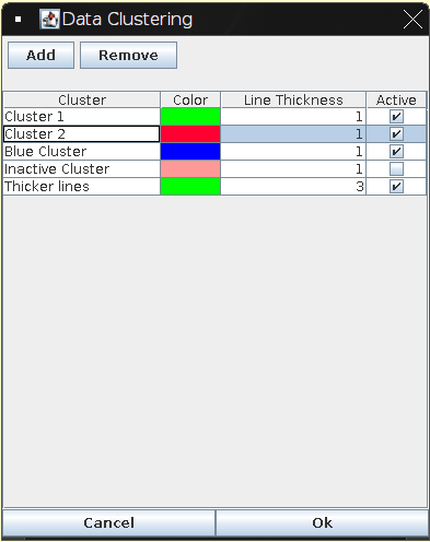
Clustering
XDAT allows you to build groups of designs and display them in different colors or remove them from the display. These groups are called clusters.
Creating a new Cluster
- In order to create a new cluster, choose "Clustering" in the "Data" menu.
- Alternatively, when you have a chart open, you can choose "Edit Clusters" from the "Clustering" menu.
- In the upcoming dialog, click "Add" and a new cluster will be added to the list.
- By default, the cluster will be named "Cluster #" (were # stands for a number chosen by XDAT automatically) and will be assigned the current active design color.
- You may change the name by double-clicking it.
- You may also change the color by clicking onto the color field.
- Enter an integer between 0 and 10 to specify the line thickness that will be used to display his cluster (since release 1.8)
- The check box behind each cluster allows you to (de-)activate the cluster's display on the chart.
Adding Designs to a Cluster
First, use filtering to remove all designs from the display that should not go into the cluster. Then, go to the "Clustering" menu, select "add filtered designs to cluster" and then choose the cluster you want to add the designs to.
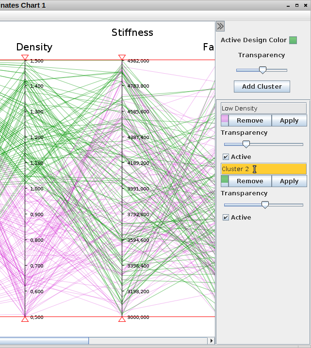
Clustering Options on the Side Panel
The whole process of clustering became a lot easier in release 2.2. You can now use the "Add Cluster" button on the chart frame side panel. The new cluster will be shown below.
Use the "Apply" button to add all visible designs to the cluster. Click on the name to change it. Use the other controls to change the color and transparency, (de)activate or remove the cluster.
Working with Sessions
XDAT provides a functionality to save the current state of your work to a so-called session file. When reloading this session file, the datasheet and all charts are loaded with all the settings made before saving.
Saving a Session
In order to save a session click "Save Session" in the "File" menu.
You may also save a session under a different file name by clicking "Save Session As" in the "File" menu.
Loading a Session
In order to load a session click "Load Session" in the "File" menu.
Working with large Datasets
I have received feedback from users stating that XDAT was reasonably performant compared to other tools with similar functionality. Nonetheless, when working with large datasets you will still experience performance issues. However, there are some steps you can take to optimize performance.
Settings affecting Performance
The easiest thing you can do to speed up the rendering of parallel charts is switching off both anti-aliasing and transparency. They make the chart prettier but slow down the repainting by an order of magnitude. See section "Customising Charts using Display Settings" to see how to adjust both settings.
Data Criteria affecting Performance
Another thing you can do is avoiding string variables. They require some additional internal calculations that can become slow when the data set is large.
Increasing the Heap Size
As all Java applications, XDAT runs in the so-called "Java Virtual Machine" (JVM). The JVM allocates a part of your RAM and makes it available to XDAT. There is a limit to the amount of memory that is used by the JVM and by default the JVM tries to set this limit to a smart value. However, in order to be able to read large datasets you may want to increase that limit.
When launching XDAT from the command line, you can do just that by adding an additional argument. E.g., to allocate 2.5GB of memory you can run XDAT with the following command:
java -Xmx2500m -jar xdat.jar
In the above command, the 2500 is the allocated heap size in megabytes. So just replace that number with whatever you need.